
Case description
About the client
The Erlomed Therapy Practice is located in Leipzig, Germany. The practice’s activities include the treatment of various diseases with occupational therapy, physiotherapy and modern impulse technology. Erlomed also offers speech therapy and therapy of different disorders of children. Erlomed Medical Practice is a multi-lingual company and takes patients in different languages.
The progressive nature of the company demands progressive marketing. We were very excited when we received the order for the full package of services for the new child branch of the company.
List of services
- Domain name
- Web hosting
- Branding Kit + Print
- Multilingual WordPress Website
- Local SEO
- Google Local Ads Campaign
Domain name and managed web hosting
We registered the name chosen by the client in our own registrar panel and connected it to Cloudflare via nameservers.
After the domain was registered, the WordPress was installed on special hosting cell we have created for the client project. Managed hosting solution specially designed for WordPress includes all needed PHP extensions and a lot of server resources. We have own servers managed by inhouse it specialists, so the setup was quick.
Branding Kit
Making of the logo was quite interesting.
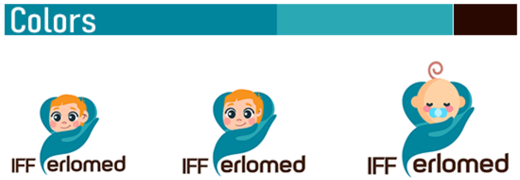
Since this is a project for a children’s clinic, its theme should be different from the classic, medical theme and at the same time not be too playful and childish. The logo should not be too childish, not only because this was a condition set by the client.
The fact is that children are not looking for solutions to their problems on the Internet. Nor do children read brochures or choose their own doctors. Our goal is to transmit a message of care and support through our logo. That way parents who are looking for help for their children can properly understand our message.
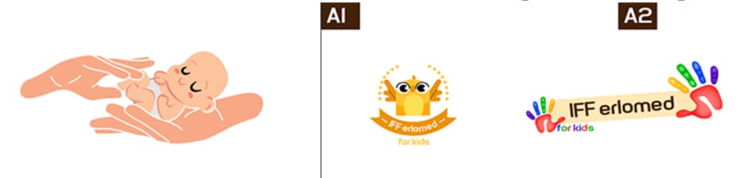
The client asked to include skin tone into logo.
The problem was, the colors and the font where already defined by corporate style guide of the main branch.
That was breaking the boundaries, working completely out of style guide. It was not what we looked for, we need to stick to style guide.
So we started with brainstorming again to redefine symbols of care and support.
Finally we thought about the heart with a hand.
Right hand symbolizes giving, while the left hand symbolize taking.
So it was too childish and the client told us that the IFF branch is for older children, not infants. At least this logo is already with corporate colors and typeface.
Back to brainstorm. The client insisted to have a human shaped silhouette in the logo.
We took the heart and the body shape and combined them, that was the best choice.
Now we knew we are very close. So finally we need another symbol of care.
Adding a stylized hand shape back where it belongs.
![]()
This final logo was accepted by the client and we could move on with the WordPress site design!
The Website
Build by our experts in UX/UI. Features innovative navigation specially made for each category main page. The website has 3 languages.
Many agencies have offered their services to us, but we will always stick to this one. Our clients and we ourselves love the websites they create. We are delighted with the process of designs creation at MEDIABERG.
In our personal panel we can always see the progress of the project. Any request of ours is implemented in the best way. The most important thing is, that we are always understood and the client is always right. This agency really fulfills its promises!

Ludmila Konkina
Owner of Erlomed, Germany


