
Case description
Preamble
In June 2021 we received an order from a relatively young company. A medium-sized company with up to 10 employees, the field of activity was construction work and the installation of electricity in buildings as well as the installation of electrical appliances. These two areas of activity were to appear in the company logo.
Making of Logo
The typography of the logo should express stability while reflecting the young age and dynamics of the company.
We started right away, after discussing the client’s requirements and looking at all the examples we were given. The first step was to playing with associations to identify the main colors. We tried to stick to the classic colors of construction sites, especially since electricity is associated with danger, and like building signs are often used colors that attract attention – red, orange.
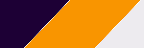
To give contrast and harmony, we used a dark blue color + hint of red, it is not as austere as black and not as soft as the light blue or blue and is suitable for our intention.
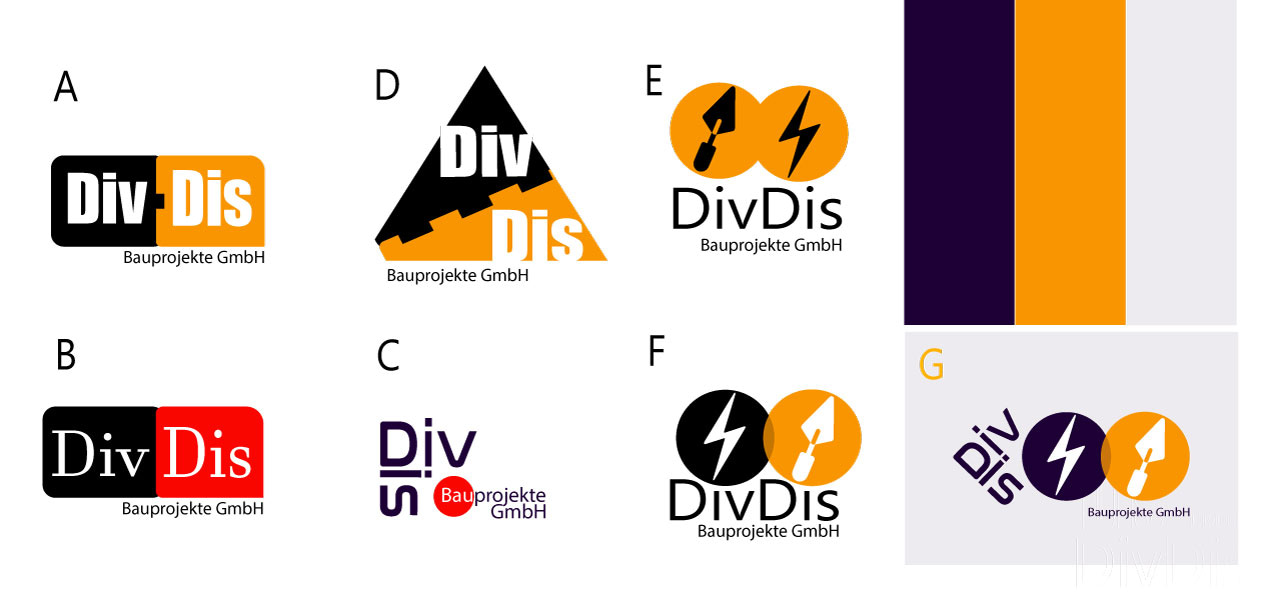
In order to underline the reliability but at the same time to express the company’s youth and dynamics, it was decided to use fonts without serifs. Simple fonts without any special ornamentation. We took a typeface that looked like wire or cable, and we knew we were on the right track.
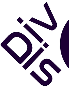
While we were experimenting with the shape of the company name, we stumbled upon the possibility of depicting the name with an angle, while adding a connection to design and construction through a hint of a geometric angle. We decided not to change the spacing of the letters in the spelling of the name to enhance the sense of dynamics.

At this point we approached the symbols of the areas of activity of the company and decided to stick to the familiar symbols. Here we took a trowel and a lightning bolt, which capture the essence of electricity and construction. But how to make a harmonious logo out of a bunch of symbols and letters that will carry messages that we want to convey through it?
For a logo to work it has to be solid and convey peace, and through harmony it has to draw attention to the context, transmitting the hidden meaning …
And then the shape of one of the sketches, where the logo is written in a thin font, horizontally – reminded us of a wave in which 2 circles can be stacked.

The two circles quickly reminded us of the Mastercard logo! At this point, everything fell into place and we presented the finished design to the client.
The client appreciated our creativity and was very satisfied.
The Final logo was made by combining two words in one angle to include the geometrical element “the angle”, which is additional symbol of construction.
We are very satisfied with your work. Fast and beautifully done. Perfectly meets our expectations and wishes. Thank you very much.

Svetlana Dieser
Director of DivDis Bauprojekte, Berlin


